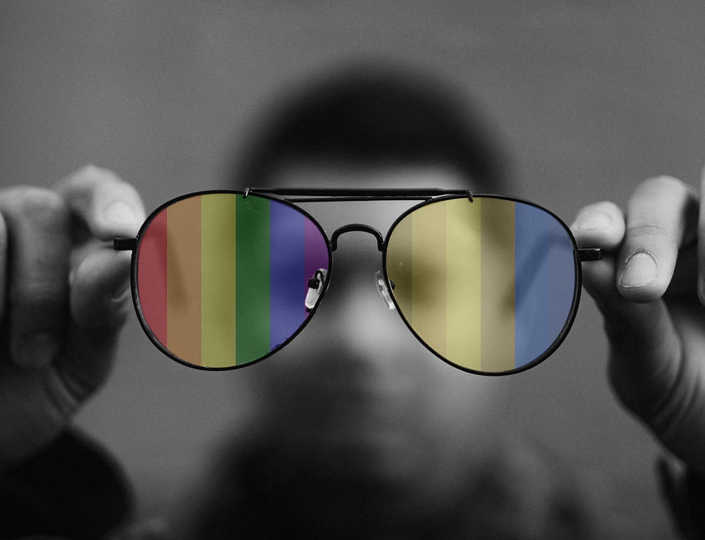
Two simple rules to design for color-blind users and everyone!

Worldwide, there are approximately 300 million people with color-blindness, almost the same number of people as the entire population of the USA.
Briefly, about color-blindness:
- Color blindness affects approximately 1 in 12 men (8%) and 1 in 200 women in the world.
- There are different types of color blindness, “Deuteranopia” and “Protanopia” are the most common.
- People with red-green color blindness (deuteranopia) have difficulty distinguishing between red and green. Similarly, to people with red color blindness (protanopia), all red colors look dull.
Most of the time, people involved in designing and developing the products are not color-blind:
As a normally sighted person, it’s hard to imagine what your work is going to look like to a color-blind eye. And yet, this can make a tremendous impact.
Imagine, you are booking a flight ticket online.
Can you select the available seat from the below user interface?

Is this not hard and frustrating for you? without a proper contrast and visual clue.
That’s the same way color-blind users react.
Imagine a frequent traveler, who is “Achro-ma-top-si-a” color-blind and can see everything only in greyscale.
When you see the desired color, it might work perfectly but not for everyone.
The COVID pandemic has forced everyone to go digital. You don’t need any more reason to include colorblind users in your design practice!
Two design rules:
(1) Colors with good contrast:

Colors must have sufficient contrast between text color and its background. This includes text on images, icons, and buttons.
It benefits the user:
- With low contrast sensitivity, which is common in older people
- With color blindness who cannot distinguish between certain colors
It also benefits everyone, during different lighting conditions, such as sunlight and glare.
Better contrast always adds value to the user experience.
(2) Never trust just color to convey a message:

Using color is a great way to add an emotional touch to user experience, however, this doesn’t convey the emotion or message to everyone, who is non-visual and visual users who cannot access color.
Don’t be afraid to use color. However, don’t just rely on color to convey a message because it can be ineffective. Combine color with text, identifiers, symbols, or patterns to design for everyone.
Conclusion
In general, every UX designer should be responsible enough in designing for everyone.
When a UX designer works for a small budget project, it’s a challenge to accommodate every aspect of the design, but just following these two simple rules will add more value to the color-blind users.
(1) Double check the contrast and
(2) Convey the message with an icon, shape, object, or label.
